In 2026, interior design is led by confidence rather than caution. Colours are deeper, finishes are richer, and spaces feel intentionally composed rather than softly blended. After years of pared-down neutrals, interiors are embracing contrast, texture and mood, with design decisions driven as much by visual impact as by function.
This year’s trends are less about fleeting statements and more about considered aesthetics: how colour, material and finish harmonise to create spaces that feel both distinctive and enduring.
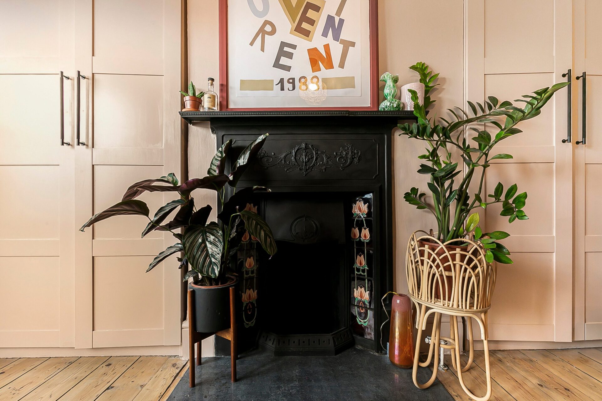
1. Grounded, Earth-Led Colour Palettes
Neutral doesn’t mean pale in 2026. Softer greys and creams are being replaced by earth-rooted tones that bring warmth and depth.
Key shades include:
- Clay and terracotta
- Burnt umber and deep olive
- Warm taupe and rich tobacco brown
These colours create a sense of permanence. They are most effective when applied in soft matt or limewash finishes, which add subtle, organic variation across surfaces.
2. Pastels, Reworked
Pastels return with a more sophisticated, “grown-up” attitude. Rather than feeling sugary or decorative, they are muted, dusty and architectural.
Look for:
- Powder blue and soft lilac
- Muted sage and chalky blush
Used on cabinetry, ceilings, or internal joinery, these tones introduce colour without overwhelming a room—particularly when layered against darker, grounding backgrounds.
3. Confident Colour Pairings
Interiors in 2026 embrace contrast in a controlled, deliberate way. Schemes feel curated rather than “safe.”
Strong pairings include:
- Olive with deep navy
- Rust with soft pink
- Bitter chocolate with pale blue
- Butter yellow with charcoal
Rather than using scattered accents, colour is framed through architectural features such as alcoves, wall-panelling and colour-blocked sections.
4. The Return of Gloss
After years of ultra-matt dominance, shine is making a comeback. High-gloss and lacquered finishes are appearing on:
- Kitchen cabinetry
- Internal doors and architraves
- Statement furniture and tiled surfaces
Used selectively, reflective finishes add depth and bounce light around a room, particularly within darker palettes. Deep forest green, oxblood and near-black shades feel especially current in a high-sheen finish.
5. Texture Over Pattern
In 2026, “visual noise” is replaced by tactile depth. The pattern is subtle and felt rather than seen.
Design interest is driven by:
- Tonal textured wallpapers
- Micro-patterned or encaustic tiles
- Ribbed, fluted, or reeded surfaces
- Layered natural materials (linen, wool and stone)
This approach keeps interiors visually rich while maintaining a calm, sophisticated atmosphere.
6. Dark Tones, Softened
Dark interiors remain influential, but the “new black” is warmer and more nuanced. Instead of stark, cold contrasts, designers are choosing:
- Soft, soot black and charcoal
- Deep espresso brown
- Green-based darks (such as obsidian)
These shades are often paired with aged metals, mid-toned woods and natural textures to create depth without harshness.
7. Tonal Rooms (Colour Drenching)
One of the most defining movements of 2026 is the tonal interior, or “colour drenching.” A single hue is layered across:
- Walls and woodwork
- Radiators and cabinetry
- Upholstery and soft furnishings
Interest is created through the interplay of finishes (e.g. a matt wall next to a gloss door in the same shade). The result is an immersive, design-forward space that feels cohesive and intentional.